With a specialized focus on healthcare design, my portfolio encompasses a broad spectrum of deliverables including website design, print collateral, and tradeshow exhibits. I am adept at crafting user-centric websites that prioritize both functionality and aesthetics, ensuring an intuitive interface for healthcare providers and patients alike. In the realm of print design, I have developed impactful materials such as brochures, reports, and promotional items, tailored to resonate with diverse healthcare audiences. Additionally, I have a proven track record in conceptualizing and executing tradeshow design, creating spaces that are not only visually engaging but also effective in conveying a brand's message and values within the healthcare sector. My comprehensive skill set in healthcare design uniquely positions me to address the multifaceted challenges that arise in this critically important industry.
I've led the redesign of Abbott’s international websites. This included over 100 interchangeable custom-designed components and accompanying global style guide standards to establish and maintain a strong, consistent, and distinctive customer experience across our corporate and divisional portfolio websites. Sample designs were included to demonstrate the placement of specific elements for the final creative.
A consistent look and feel of Abbott websites globally is focused on creating a familiar experience for their customers and increasing brand recognition. By defining the building block elements, the standards allow for creativity and individuality within each international division website.
The redesign of Dr. Phil’s Bydureon ON IT Movement responsive microsite, also included banner ads, emails, brochures, and social media marketing. The design improvements bring the user's attention to the signup form and break up the previous lengthy content into easily digestible areas that were clearly defined. As art director on this project, I led my team of designers to coordinate this very tight one-month deadline from start to finish.
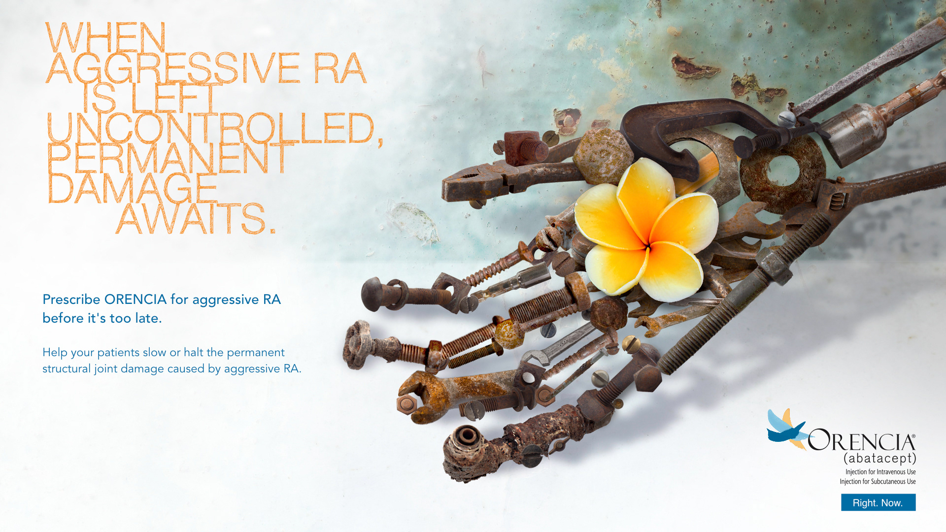
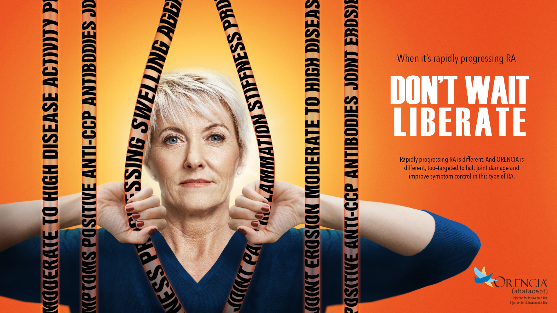
This rebranding advertisement was created for the rheumatoid arthritis drug ORENCIA, a Bristol Myers Squibb product. Teamed up with a copywriter we would come up with several headlines and discuss potential visual concepts. Sketches were quickly put together and once approved the final visuals were put together. This design was created by taking multiple stock photos, masking, editing, and then placing them into the final design. Because of my knowledge of 3D, I was able to quickly manipulate the metal hand to give it depth. When working with text headlines I use fonts that tie into the design's visual message. The final design took less than 8 hours.
When creating marking materials I like to work closely with copywriters to discuss conceptual approaches that will grab a patient's attention and give them clean understandable content. Whenever possible I also like to create infographics to help patients understand complexities otherwise lost in heavy text content.
This trade show booth for Sun Pharmaceuticals was created from an initial concept to a full-scale 20’ x 30’ booth for the NACDS Convention located at the Colorado Convention Center, Denver CO.
The NARCAN.com website underwent a comprehensive redesign to address the client's challenges with multiple users. The streamlined new version features user-friendly navigation and offers concise, easily digestible content that efficiently guides visitors through valuable information.
This Cutanea, Aktipak HCP leave behind brochure gives informative patient profiles and how 8 weeks of Aktipak treatment led to significantly higher scores than their competitor’s brand. The design was created to emphasize the ‘active patient’ and their lifestyles.
The advertisement for Know Narcolepsy was designed specifically for Sleep Review magazine. Its aim is to direct healthcare professionals to the KnowNarcolepsy.com website, where they can access patient research and discover various treatment options for narcolepsy.
This rebranding advertisement was created for the rheumatoid arthritis drug ORENCIA. The original campaign visuals used the 'word ropes' wrapped around the patient's wrists, holding them back. The evolution of the campaign would use the ropes with a different approach, by creating concepts that put the patient trying to get back their control. The final design was put together using several photographs compositing them together, editing, and creating visual effects to give a vintage look.

The advertisements below were all designed and produced in Adobe Photoshop. When creating designs my approach is never to directly download stock imagery and add some headline and copy to it, but rather create impactful visuals that push boundaries and grab the audience's attention.
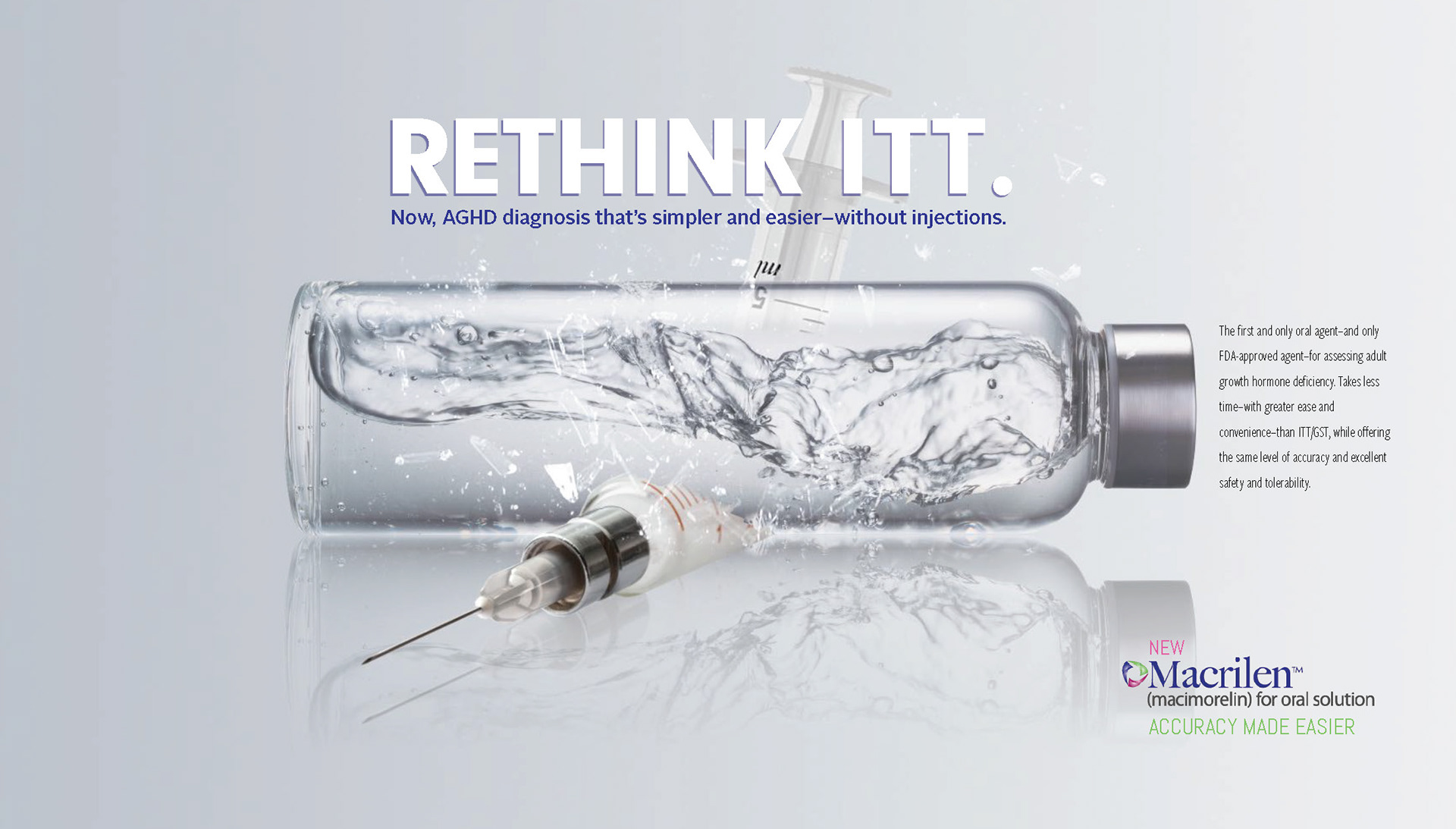

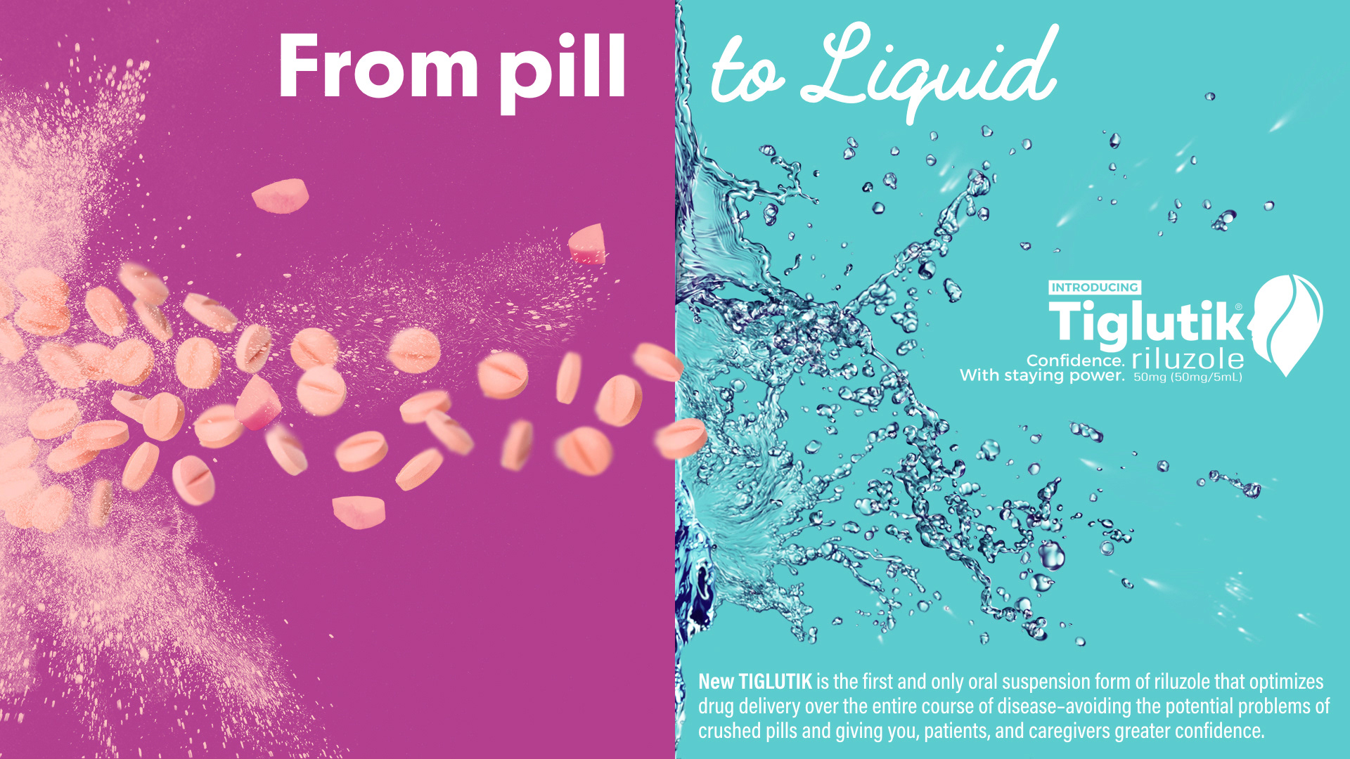
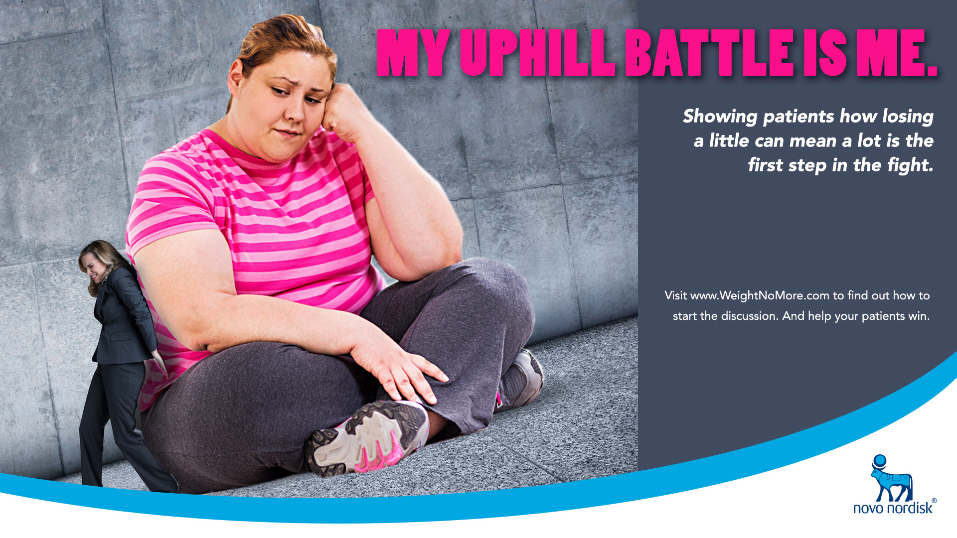
As an experienced retoucher for several professional photographers, I've spent a lot of time mastering the use of Photoshop to manipulate imagery and give my designs a high-end polished look.


As a senior art director, my daily role was to create the marketing material for the patient side of the ORENCIA brand. This included brochures, banner ads, email campaigns, tradeshow materials, and a total website redesign. This brochure was created in InDesign with custom illustrations. When laying out designs I use clean approachable layouts and work with copywriters to produce content that is easily digestible for patients.
This poster was specifically crafted for display in healthcare provider settings. It represents a streamlined version of what originally constituted multiple pages of content, aiming to mitigate the information overload commonly associated with marketing materials. Additionally, I was responsible for the visual representation of key biological components, meticulously illustrated to meet the high standards and expectations of healthcare professionals.
I've spent many years developing my craft as a web designer. I've worked side by side with marketing and analytics professionals who taught me the best practices when creating layouts online. I have experience in building websites from wireframes to HTML development. Having a firm grasp on the entire process ensures clients that their website will engage their audience with positive ROI.
The overall aesthetic and layout of this GSK Innovations website, including its graphic elements and icons, are crafted through responsive design.
The Phillips redesign initiative featured UI/UX elements that accommodate a range of products. Clicking on a product will centralize it, as if "in the hands," while an informational pop-up appears to enhance customer engagement.